
Fragrances
Launch
Karina Rabolini


BRAND IMAGE
OF KARINA RABOLINI
FOR FRAGRANCES
In conjunction with the TVG S.A. company, we developed the brand image for Karina Rabolini´s fragrances. Under the guidelines of this model/designer along with her team, we worked on each fragrance´s brand, its packaging and brand marketing.
Season
Campaigns
Easy


COLORS ACCORDING
TO EACH SEASON
OF THE YEAR
We developed Point of Purchase graphic systems for all the EASY retail stores to decorate their premises during several seasons. The Visual Merchandise sector informed us what the season´s theme was and our studio transformed the concepts into meaningful images.
Season
Campaigns
Bahía Aventura


A THEME PARK BETWEEN THE RIVER AND THE SEA
We developed the image of the theme park operated by Mundo Marino S.A. The particular location, at the southernmost point of the Sanborombón Bay, pays tribute to the epic of man and nautical activites with its lighthouse, highlighting nature in its various forms of expression.
Content development in editorial format
Client Management
Interactive
Nestlé Waters


AN INTERACTIVE SYSTEM TO IMPROVE THE QUALITY
We resolved the image of the interactive system which was applied to the desktop computers in the Nestlé Waters offices. The company reinforced concepts regarding customer care, visualizing them through this platform.
Planeta Web
Magazine
Telefónica


DIGITAL NEWS ON PAPER!
With the launching of the internet provisioning systems there was a need to find out more about the possibilities of the network. During two years we developed the Advance Magazine for Telefónica Company.
Presentation
Brochure
Pol-Ka Productions


PRESENTATION IN SOCIETY
The well-known production company Pol-ka had more than 15 shows running; series, films, and single episodes, and needed a catalogue to compile all of its products. We developed the presentation brochure unifying the company´s entire production.
Presentation
Brochure
Hepatalgina


PRESENTATION AT CONFERENCES AND EVENTS
Hepatalgina is well known in Argentina as the generic drug used for digestive disorders. We developed a catalogue to use at medical conferences, focusing on the future expansion of the product at a regional level.
Presentation
Brochure
It Gets Better


EVERYTHING´S GETTING BETTER FOR THE LGBTQ+ COMMUNITY
We are members of It Gets Better Argentina, an NGO that enhances the positive image of the LGBTQ+ community, empowering young people and adolescents. Originating in Los Angeles, California, we support the Argentine subsidiary among several members. Our studio develops its image and brand marketing.
Direct Sales
Catalog
Karina Rabolini


FASHION AND TREND: DIRECT SELLING VERSION
Development of publishing activity, image and packaging of Karina Rabolini´s direct sales. The design originated in our studio and the manufacturing took place in the following countries, Argentina, Italy and China.
Monthly
Magazine
Diez %




FIRST LGBTQ+ EDITORIAL
IN ARGENTINA
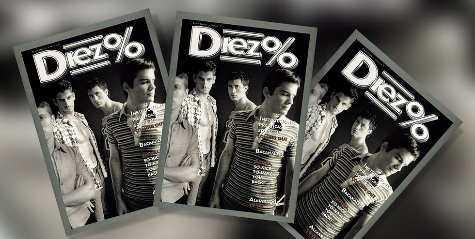
Ten% was the first LGBTQ+ magazine to openly go public in Argentina. The magazine featured several columnists, Fernando Peña, Ronnie Arias, La Barbie, Sir James and many other well-known personalities. The photography was carried out by Machado and Roca Studio, the fashion production by Fabian Medina Flores and the design by our studio.
Presentation
Brochure
Inteligent Homes


SMART HOUSES ARRIVE
This innovative product requires a complex explanation in order to be understood by consumers. The presentation brochure illustrates the potential of a smart house, which greets its homeowners with just the right temperature, the lights on as well as their favorite TV channel.
Campaña
Estreno
Fernando Peña
BIENVENIDOS AL FUTURO
Este proyecto propone una exhibición de recorrido unidireccional a través de una casa en el futuro. Los visitantes hacen su Log-In al inicio del recorrido y luego la casa los reconoce en las distintos espacios. El lenguaje gráfico de esta muestra responde a la sumatoria de "distintas ideas de futuros" creadas por la TV y el cine. Presenta a robots icónicos de todos los tiempos.
Campaña
Estreno
Fernando Peña
Planetario
de la ciudad de
Buenos Aires
EL ESPACIO VERSIÓN RETRO
Se buscó generar un sistema de señalización no invasivo, que armonice con el espacio verde. Las tipologías de señalización van desde el plano general del parque, pasan por los subsectores, los edificios patrimoniales y finalizan en los textos de concepto e información didáctica. Un elementos de gráfica adyacente basado e 4 elipses cita y homenajea al sistema original de traza del parque ideado por el paisajista Carlos Thays a finales del siglo XIX.
Planetario
de la ciudad de
Buenos Aires
Disseminating information, launching campaigns or creating editorials, we know how to communicate the concepts of entertainment and leisure time.
Communication
Development of contents for dissemination.
Life in
the Water
Temaikén
Ecopark
of the city of
Buenos Aires
Place
for Birds
Temaikén
Planetarium
of the city of
Buenos Aires
Interactive Album
River Soccer
Museum
Life's
Ark
Temaikén
The House
of the Future
Tecnópolis


WELCOME TO THE FUTURE
This project proposes a one-way tour through a house of the future. Visitors log in at the beginning of the tour and then the house recognizes them as they go through the different spaces. The graphic design of this exhibit responds to the “different ideas about the future”, created by TV and the cinema, presenting the iconic robots of all times.
Image Design
Buenos Aires
Zoo


PRODUCTS FOR RETAIL MERCHANDISE
During the privatization of the Buenos Aires Zoo, we created a limited edition of products to be sold in stores. It was one of the first “brands” to be adopted by the zoo, which until that moment had been called Municipal Zoological Garden. This work was published in Tokyo, Japan, by PIE Publishers, as part of the Design Book collection.
Launch campaigns, premieres and events
Fragrances
Launch
Sarkany


SARKANY´S BRAND IMAGE FOR FRAGRANCES
In conjunction with the TVG S.A. Company, we developed the brand image of fragrances for the Sarkany company. Under the designer and his team´s guidelines, we worked on each fragrance´s brand, its packaging and brand marketing.
Fashion Show
Campaign
L'oréal


A FASHION SHOW ON THE MOST IMPRESSIVE STEPS
We created the brand image of the first L’oréal fashion show on the steps of the University of Buenos Aires Law School. The fashion show brought together for the first time top models such as Claudia Schieffer, Naomi Campbell, Cindy Crawford and Valeria Mazza who hosted the event.
Launch
Campaign
Boca Soccer Museum


THE FIRST SOUTH AMERICAN MUSEUM OF TECHNOLOGY
In addition to having designed the museum exhibits and furnishings, we developed the brand image and launching campaign for the museum. The brochure system was published in Tokyo, Japan, for the Design Book collection, by PIE Publishers.
Premiere
Campaign
Fernando Peña


POLITICALLY INCORRECT CAMPAIGNS
We worked on the image for several of Fernando Peña´s shows (who was also a personal friend for nearly 20 years). Honestly, downloading what came out of his head was as difficult as it was fun. These are two of the campaigns we did: “Esquizopeña” and “Esquizopeña El Musical”.
Season
Campaigns
Mundo Marino


THE LARGEST OCEANARIUM IN SOUTH AMERICA
We developed campaigns for Mundo Marina S.A. under the creative direction of Héctor Berra. The work on the image included redesigning the brand, developing brochures, advertising and the press. Scenography was also designed for the different shows.
Premiere
Campaign
Romeo & Julieta


SHAKESPEARE IN A POP VERSION
We developed the image for Javier Faroni´s theatrical production. From the marquee to the brochures and the premiere campaign, we were responsible for all the communication in public advertising.
This project received the “Estrella de Mar” award for best graphic design, one of the most important awards for theatrical recognition in Argentina.
Beauty Salons
Campaign
L'oréal


PROMOTIONAL SYSTEM
During the first half of the 90s, the L´oréal Company was positioned as market leader in the cosmetic industry, incorporating products previously not marketed under its brand. Using the distribution in beauty salons, this imaging system promoted the different aspects of the brand, from hair care to make-up.


SIGNAGE FOR DISSEMINATION
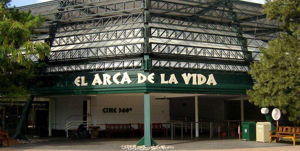
At the exit of the 360 degree theater in Temaikén, we developed a space to communicate the conservation projects which the foundation carries out. We use a language of large-scale images, and there are also playful and very striking sculptures. Some texts explore topics more thoroughly for those who wish to learn more details about the programs.


THERE´S A TEAM!
The site “In River there is a Team!” was developed for the River Museum featuring touchscreen devices.
The language used for this interactive activity belong to a Figurine Album, in which the participants can create their favorite team by choosing players from different eras.


THE STORY OF RIVERS,
SEAS AND OCEANS
In 2019, a special exhibit called “Life in the Water” took place throughout the entire Temaikén aquarium.
The exhibition based its contents on the history of life in water since pre-Cambrian times. We developed the communication of the scientific contents working with diagrams and hyper-realistic illustrations for a better understanding for both adults and children.


GRAPHIC SYSTEM
FOR ECOPARK
Outdoor signage was created to harmonize with the green space. The types of signage start with the general map of the park and end with the descriptive texts and educational information. An adjacent graphic element based on 4 ellipses, quotes and pays homage to the original layout of the park designed by the landscaper Carlos Thays, at the end of the 19th century.


A NEOCLASSIC MUSEUM INVITES YOU TO PARTICIPATE
The building of this interpretation center resembles an old gazebo from the Belle Epoque. The furniture adds to the aesthetics of the old museums of natural science. Its image and forms of communication also evoke the illustrations and reports of naturalists from the past. The pictorial representations define the language of communication used in this space.


THE LANGUAGE OF SPACE IN RETRO VERSION
The Galileo Galilei Planetarium was inaugurated in 1968. It was designed with an expressive architectural trend, in keeping with the movements of the mid-20th century.
The communication used by our studio inside the planetarium, in the museum and in the interactive systems, accompanies the architectural “future retro” language of the building.

